Having an Ocean of Data Is Not Enough: You Need to Know How to Extract Value

28.4.2023

6-7 min
reading time
28.4.2023
6-7 min
reading time
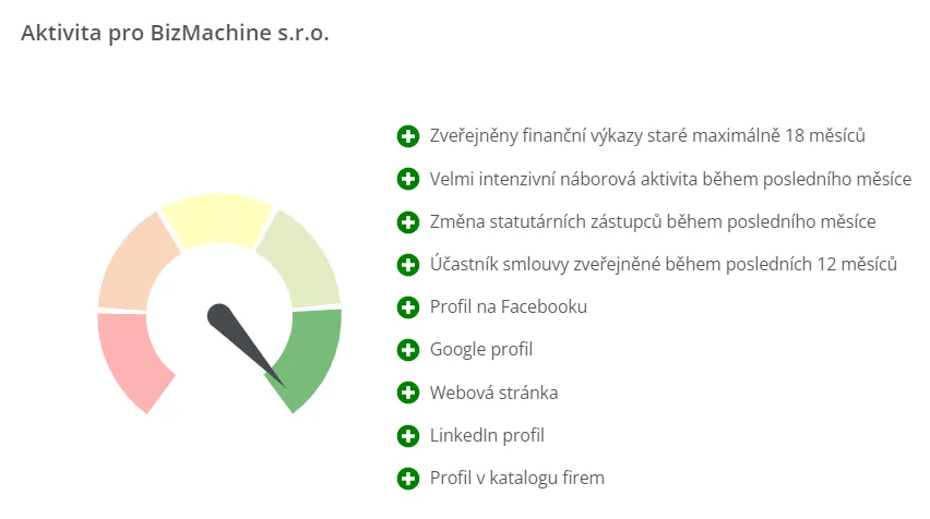
In Prospector, an online window into the most accurate live database of Czech, Slovak, and Hungarian companies, you’ll find three “gauges” at first glance that rate each company. You might remember them from the era when cars had mechanical fuel indicators. The needle moved from right to left toward the red zone as you consumed fuel. In Prospector, these three gauges work similarly. At a glance, the needle shows whether a company is active or accessible. If the needle is in the green zone on the last gauge too, it’s clear the company is also growing. Although they look simple, behind these indicators lies countless data and a lot of work. We spoke about the origin and purpose of these BizMachine indicators with our colleague Petr Kalát, who is one of their creators.
We have a truly massive amount of data. But for that data to be useful to our clients, we need to serve it in a way that’s understandable and clear. When you want a quick look at a specific company and open its profile in Prospector, you don’t want to download an Excel file with 300 rows of various data, spend half an hour going through it, and wonder what to take away. You need to quickly know whether and how a given company is active, or whether it’s even possible to contact them. And that’s exactly what our BizMachine indicators in Prospector are for—they’re not just data. They’re data made visually digestible.
It’s a brilliant way of communicating a really large volume of data so that our clients get the information they need almost instantly. Our indicators take into account over 200 different metrics from more than 50 different data sources. And as a user, you don’t even need to see or know that. At first glance, in a maximum of 2 seconds and without much thought, you absorb an enormous amount of information. And in a very clear, user-friendly way. A company is green, orange, or red. Great information at first glance. But finding the key to quickly visualizing large volumes of data in a way that you can serve with certainty that everyone will understand what they’re looking at without explanation—that takes time. But once you have that form of data representation, it seems completely logical and obvious.
Virtually all the data we collect about companies at BizMachine plays a role in our indicators. The most inputs go into the activity indicator, which is the most complete and comprehensive. Around 150 signals feed into it. These include things like whether a company has a working website, has registered a new branch, is buying company cars, is participating in public tenders, has won a tender, or is actively looking for people on job portals. We have all this information. And when we connect it, half the work is done. The second step is to score each signal—to say whether it has a positive or negative effect on the company’s overall activity. So while hiring people is a positive point, a broken website or insolvency are negative markers.
Definitely not. Some things naturally have a bigger effect and others smaller. The overall score also factors in the strength valuation of each signal. For example, if a company had a job ad a year ago, that’s not as strong a signal as when they’re looking for people right now. Similarly, a filled-out profile on a business directory is a weaker signal for us than the already-mentioned active job ad.
You fill out a directory profile once and you have it. We have no way to tell if you’re still in business and whether it’s correctly filled out, current, and fresh. Plus, it costs you virtually nothing—neither time nor money. But when you’re paying for a job ad, you also had to write it and pay for it—that’s a much stronger sign for us that you’re currently an active company. It’s perhaps important to mention that these indicators are definitely not static. If a major change happens at a company, the change is reflected almost immediately. We update most of our data on a daily basis.
Some selected signals probably correlate with company size. After all, big brands are written about more often in the media, they may be hiring more people, changes may happen more frequently, and so on. But we’re not running a competition. We’re not looking for the most active company in the country. Our goal is to compare companies with each other, but we don’t show the overall score externally—rather, we show a relative comparison with others. So the way it works is you mark all signals according to whether they have a positive or negative influence and how big a role they play. You calculate it. You get a number, but you don’t display it anywhere. It wouldn’t mean anything to anyone. So you normalize the entire population of companies. That means you line the companies up next to each other and rank them on a scale, let’s say from 0 to 100. And we then show this scale with the gauge needle and color. So you don’t say this company has a score of 370—that would be useless. Is it a lot? Is it a little? You say, this company is green. So it’s active and will likely be a better target for my sales offers than a company that’s red, which means it has some significant problems. In short, our little gauges offer easily understandable aggregated scored data that you can read without necessarily needing to see any numbers.
Color serves as basic orientation. If you’re interested in detail, just click on the gauge and you’ll see a maximum of 10 to 15 of the strongest signals that contributed to the company’s placement in one category or another. And right next to them, you can see whether they were plus or minus points. For example, if a company is super active but is laying off people, it will be green, but after clicking you’ll see the layoffs with a red minus at the end. When you want detail or greater depth, we simply and transparently offer it with one click. And by the way, you can also immediately see what the score was calculated from. And that nicely demonstrates what data we collect at BizMachine and what we know about companies.
The best feedback for us comes from our clients. They use our data, and if it were misleading, they give us feedback. Some indicators—for example, the accessibility indicator—we have calibrated thanks to quantitative feedback from a large call center. We really primarily listen to our customers, and based on what brings them value, we know how to fine-tune the indicators.
Currently, I’m the closest to what you could call the author of the indicators. But I think the whole idea originally came from Martin Nepraš, one of our three founders, back in 2017. Even then, we had lots of data and a wealth of information flowing from it, and we were thinking about how best to mine and use it. And in a group of two or three people, we arrived at the idea of aggregating our data in a way that would lead to deriving some specific synthetic value from it. And so the idea for these indicators was born. And I enjoy that even after all these years, the idea works. Our indicators are a great way to show and visualize the volume of data we have, so that it’s useful and gives a clear picture at first glance of how a given company is doing.


Tereza Rejchrtova
Tereza Rejchrtova helps people understand how to use data to their advantage. She has over five years of experience in SaaS marketing, specializing in product and content marketing for B2B. She focuses on connecting complex topics with clear, accessible content.

Pernerova 697/35
186 00 Praha 8
Czech Republic

+420 735 121 860
